Short Functional Description
Important
The English version of this Visual CMS documentation serves only as a basis and for developers and does not contain all details. More comprehensive documentation can be found in the German documentation.
CMS-pages can be changed by adding or editing widgets. The Visual CMS allows you to edit CMS pages in a fast and comfortable manner. Pages with the Disable widgets and use only text option active are not managed through the widget editor and still function as before.
Understanding the Grid
Visual CMS uses the Bootstrap 5 grid system to structure page content. The fundamental building block is the Row widget. Widgets placed inside a Row automatically act as columns within that row, following the standard Bootstrap column layout.
The Row widget is also the key to responsive layout. Visual CMS allows you to configure widget sizes per device size. Widgets inside the same Row may each take up the full width (12 columns) on smaller devices, stacking vertically, but then align side by side on larger devices — all while staying in the same logical row group. This makes the Row widget the container that controls how its widgets reflow across breakpoints.
If you need to place multiple widgets inside a single column, use the special Column widget. It renders as a Bootstrap column and only accepts a Row widget at its first level, inside which further widgets can be placed as columns.
In short:
Row → Widgets — each widget is a column in that row.
Row → Column widget → Widgets — use the Column widget when you need to nest widgets inside a column.
Device Selection and Responsive Layout
Visual CMS supports six responsive breakpoints, selectable through the device-switcher in the editor toolbar (always visible while editing, not inside the widget dialog). The six breakpoints, matching the keys used in the JSON layout tree (see JSON View below), are:
small-mobile— Small smart phone (< 576 px)mobile— Smart phone (576 – 768 px)tablet— Tablet (768 – 992 px) — default editor viewlaptop— Small screen (992 – 1200 px)desktop— Big screen (1200 – 1399 px)large-desktop— Extra big screen (≥ 1400 px)
The currently selected breakpoint is highlighted in the toolbar. Clicking a device toggles the editor canvas to that viewport. The editor opens on the Tablet view by default; from there you are free to configure widget sizes in any order — there is no “master” breakpoint to design for first. This is the anything-first model introduced with Bundle 10: each breakpoint row can be set explicitly.
Per-breakpoint widget widths can be set in two equivalent ways. The faster one is directly on the canvas: hover a content widget and drag its right edge — the widget resizes horizontally in grid-column steps (height is content-driven). The drag updates the width for the currently selected breakpoint only; values configured for other breakpoints remain untouched. Switch the device in the toolbar, drag again, and you have set per-device widths in the most natural way.
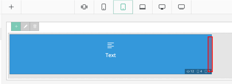
The resize handle on the right edge of a content widget. Drag horizontally to change the width for the breakpoint currently active in the toolbar above.
Row widgets cannot be resized on the canvas — they always span the full grid. Only content widgets nested inside a Row carry the resize handle.
For precise control — including offset and per-device hide — open the widget’s edit dialog and switch to the Layout settings tab. The tab holds a table with six rows (one per device type) and four columns:
Device — the device-type label.
Offset — horizontal offset in columns; shifts the widget to the right. “No offset” or Inherit (default) when left unset.
Width — widget width in columns. The default grid is 12 columns per row, configurable in module settings under . Inherit (default) cascades the value from the next-smaller breakpoint.
Hide — checkbox per device; removes the widget from that breakpoint completely.
Inherit (default) means the widget falls back to the next-smaller breakpoint’s value, which gives mobile-first cascades out of the box — set a value on small-mobile and, unless overridden, every larger breakpoint inherits it.
Note
Canvas-drag and the Layout settings table both write the same per-device offset, width and visibility — choose whichever is faster for the change you need to make.
Content Activity
Every CMS page carries an Active checkbox at the top of the left-hand settings menu plus an associated activation period. A page can be switched on/off manually or scheduled to be active during a specific window. Inactive pages are not served to visitors.
Widget Activity
Beyond page-level activation, Visual CMS provides fine-grained time-based visibility on the widget level. Every widget — and every Row element — carries an Activity area inside the General settings tab of its edit dialog. Widgets can be shown during a defined window, or conversely, hidden during a window (via the Exclusion checkbox on each range). Typical uses include time-boxed promo codes, seasonal banners, or campaign highlights that appear and disappear on schedule without manual intervention.
The Activity area is built from two element types:
Range — a single time window: Start date + Start time, End date + End time, and an Exclusion checkbox that inverts the range (meaning “NOT during this window”). Added with the green-outlined + button tooltipped Add range.
Group — a container for ranges (and further groups), with its own logic selector: And or Or. Added with the blue + button tooltipped Add group. Groups can be nested arbitrarily, which is how complex rules like “active during business hours AND NOT on weekends” are modelled.
Multiple ranges on the same level combine with logical OR: the widget is visible if at least one range matches. Each range and each group can be removed with ×. Dates and times are shown in the language of the admin area and respect the 12/24-hour format conventions of that language. Date/time pickers are Flatpickr-based.
In the JSON View, these rules surface as the activity key on every widget: {"type": "always", "conditions": []} for always-visible, or the equivalent structured condition tree.
Preview
The Preview button in the left-hand menu renders the current page exactly as the shop would serve it to a visitor. The preview uses the latest in-editor state; no prior save is required, which allows for rapid iteration: change a widget’s layout or activity window, preview, adjust.
Two options next to the preview button control what gets rendered:
Select preview device size — pick the breakpoint to render at: Small mobile (<576 px), Mobile (≥576 px), Tablet (≥768 px), Laptop (≥992 px), Desktop (≥1200 px), or Large desktop (≥1400 px).
Imitate specific time: — a
datetime-localfield (formatYYYY-MM-DD HH:MM:SS). When set, every activity rule is evaluated as if it were that moment.
Preview and Time Management
By default, the preview evaluates activity rules against the current moment:
A widget whose activity window has not yet started is not rendered.
A widget whose window is active is rendered.
A widget whose window has already ended is not rendered.
Page-level activation is evaluated the same way.
With Imitate specific time: set, the preview instead evaluates every activity rule against that custom moment. This is the supported way to verify how a scheduled campaign will look once it goes live — fill in the target date and time, click Preview, and the page renders as it would at that instant. No widget activity conditions need to be changed for the test.
Templates
The template system stores a snapshot of the current page’s widget layout under a user-supplied name. Saved templates are listed in the left-hand template panel with four actions per entry: apply (replaces the current page’s content with the template), preview, and delete.
Templates only include the widget structure from the content editor. Settings in the left-hand panel (title, identifier, folder, layout flags, SEO fields, etc.) are not part of a template and are not overwritten when applying one.
Important
Templates are not language-scoped. All saved templates are visible and usable regardless of the current editing language. If you need language-specific variants, prefix the template name with a language code (en-, de-, …) so the list stays navigable.
Language Switching
CMS content is language-aware: each language holds its own widget tree. The language dropdown at the top of the editor switches between the language versions of the currently open CMS content. Switching yields an independent editing surface per language.
Two modes are offered:
Load language — replaces the editor with the selected language’s content. Unsaved changes in the current language are lost.
Apply content to <Language> — copies the current editor state into the selected language. If the target language already had content, it is overwritten.
“Apply content” is the recommended way to seed a new translation from an existing one: keep a fully edited base language, transfer it into the empty target, and then adjust the translated copy in place.
Note
The shop administration language (chosen at login) does not affect which content language is shown first in the editor — the default content language comes from shop configuration, not from the admin session.
JSON View
Visual CMS provides a JSON view of the current page configuration. It can be used to inspect the full widget tree, make direct modifications, or copy the content structure to another page.
Warning
The JSON view bypasses the constraints enforced by the editor interface — it is possible to place any widget inside any other widget, including combinations that the UI intentionally prevents. This can be useful in advanced scenarios where the interface does not offer a needed option, but should only be used with a clear understanding of the widget structure and its implications.
The JSON represents a tree of widgets, where each entry contains:
widget— the widget type (e.g.row,column,image).widget_params— the widget’s own configuration options.children— nested widgets inside this widget.layout— responsive width, offset and visibility settings per device size.activity— visibility conditions for the widget.
Example:
[
    {
        "widget": "row",
        "widget_params": [],
        "children": [
            {
                "widget": "column",
                "widget_params": {
                    "class": "",
                    "background_color": "",
                    "background_image": "",
                    "background_fixed": ""
                },
                "children": [
                    {
                        "widget": "row",
                        "widget_params": [],
                        "children": [
                            {
                                "widget": "image",
                                "widget_params": {
                                    "title": "some title 1",
                                    "image": "a50d519808cd4576c62bfc02b91a2100"
                                },
                                "children": [],
                                "layout": {
                                    "width": {"small-mobile": 12},
                                    "offset": {},
                                    "hide": {}
                                },
                                "activity": {"type": "always", "conditions": []}
                            }
                        ],
                        "layout": {
                            "width": {"small-mobile": 12},
                            "offset": {},
                            "hide": {}
                        },
                        "activity": {"type": "always", "conditions": []}
                    }
                ],
                "layout": {
                    "width": {"small-mobile": 12, "tablet": "6"},
                    "offset": {},
                    "hide": {}
                },
                "activity": {"type": "always", "conditions": []}
            }
        ],
        "layout": {
            "width": {"small-mobile": 12},
            "offset": {},
            "hide": {}
        },
        "activity": {"type": "always", "conditions": []}
    }
]